
Project Overview
Oppia is a global online learning platform for under-resourced learners, with over 1 million active users. It provides curated lessons in four languages and an extensive Exploration Library with over 20,000 lessons across 17 subjects, offering a wide range of educational resources for knowledge acquisition.
Currently, Oppia users are limited to signing up with a Google account, which excludes a significant number of learners and contributors who don't have one. While creating a Google account is straightforward, allowing non-Google sign-ups would make Oppia more accessible to everyone.
The current account creation flow only caters to users with Google accounts. Learners who do not meet age requirements/do not have access to a Google account will be unable to access the Learner Dashboard to track their progress and access other sign-in-only features. Potential contributors without Google accounts can't access the Creator/Contributor dashboards to create or contribute to lesson content.

I also had a discussion with the research team and made an estimation of the number of users who could benefit from this project.

So problem identified, then....

1. Evaluate the current key flows to learn gaps and opportunities.
2. Analyze common sign-in and account creation journeys on other similar platfroms.
1. Ideated possible design solutions of account creation, sign-in, account recovery for addressing user pain points.
2. Prototyped low and high-fidelity designs.


I discussed with the design lead and PM whether we should require complex passwords during the account creation flow. My point was as a children's learning platform, the risk associated with the platforms is generally lower, reducing the need for overly complex passwords. To ensure a good user experience, it may not always be necessary to implement complex password requirements or two-factor authentication. Instead, basic password requirements like having a minimum length and suggesting the use of a combination of letters and numbers can help strike a balance between usability and security. A visual indicator can also be provided to show if the entered password meets the requirements, making it easier for users to complete the task quickly.

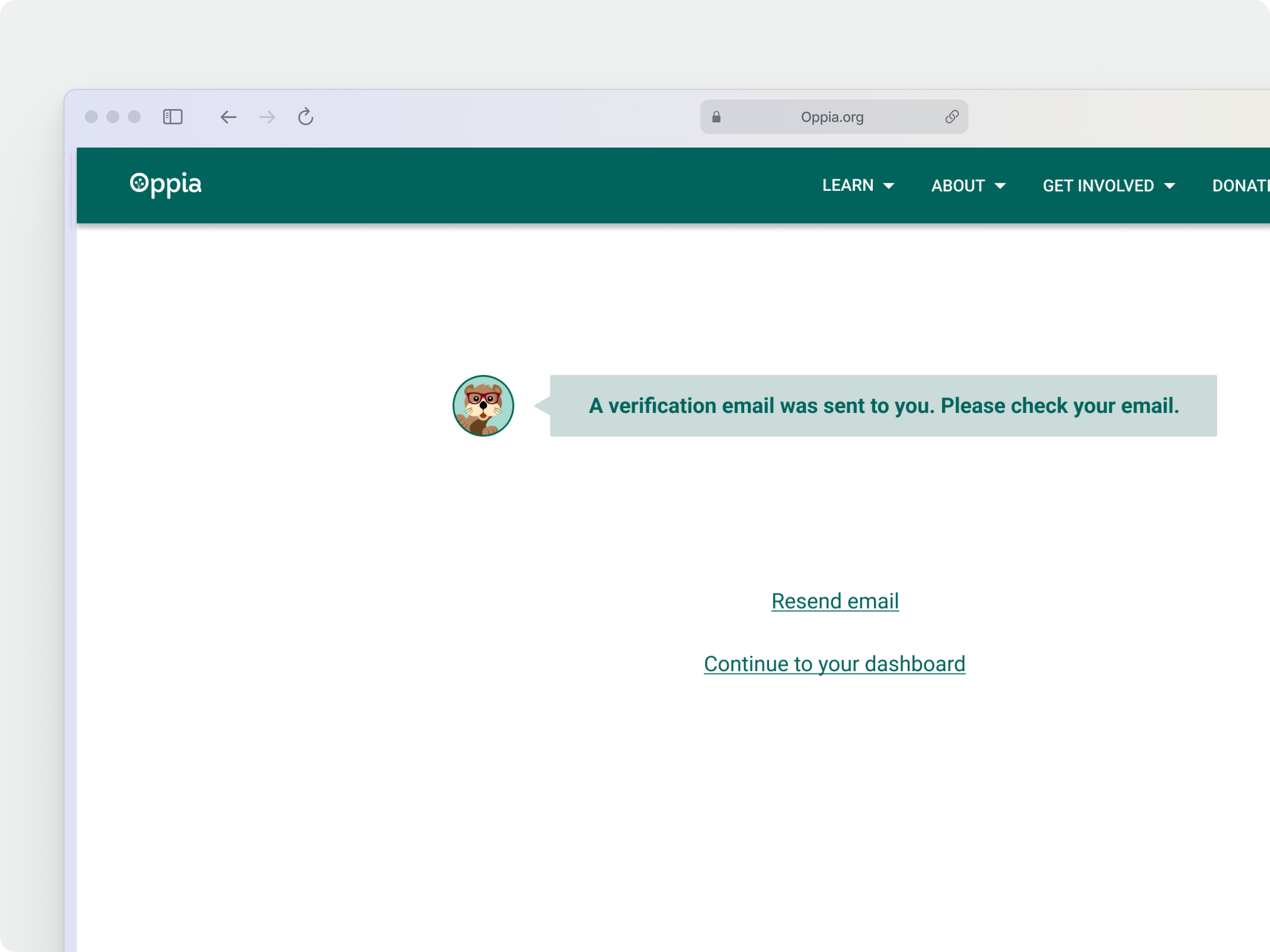
To reduce the risk of users using unauthorized email addresses and to improve the password retrieval process, it is mandatory to verify your email within 14 days of account creation. Email verification adds an extra layer of security by involving parents or guardians in the password reset process. If a child requests a password reset, an email will be sent to the registered email address, informing them of the action and allowing them to provide consent if needed.

When retrieving a password, using email verification is a simple and commonly used method that is easily accessible to both children and contributors. By utilizing their existing knowledge and behavior, the retrieval process becomes more intuitive and easier for them to understand and follow.

During the early phases, I conducted visual experiments to discover where the branding elements should be placed in the design. While using Otter as a brand touchpoint might seem attractive, it could also cause confusion and distract users from the primary objective. After discussing with PM, I chose to use it for communicating with the user rather than for core functionality, such as buttons.

Another way to enhance emotional value was by using a positive tone and simple language to appeal to our primary audience. Taking the feedback from the UX copywriters, I revised the writing to show more excitement and simplify the language in the instructions.


As part of my responsibilities, I frequently proposed solutions to both leadership and cross-functional teams. It was important for me to prioritize feedback and make adjustments to designs in a timely manner based on the product roadmap. Throughout the project, I collaborated with product, research, engineering, and content teams at all stages. In addition, I facilitated brainstorming sessions to ensure that everyone's vision was aligned and that we had a clear product framework established.
🤜 In a city of trade-offs
Although there are established industry standards for creating and signing into accounts, each platform is unique, resulting in a slightly different user experience. Finding the right balance between security and ease of use was a challenge. Since our platform caters mostly to young users, the account creation process should be straightforward and easy to comprehend. As a product designer, I'm well-versed in the standard onboarding flow, which is why I aimed to add more value to both the business and the user without disrupting their experience. Therefore, I made careful decisions to increase visual appeal and reinforce brand identity without causing confusion.
🪄 The best design might be the simplest
It was tempting to overhaul the entire experience from the start, but in reality, users just needed a clear CTA to proceed with signing in/ creating their accounts. Focus on the jobs to be done in the flow help me think clearly when making design decisions.
👀 What is the next step?
I have some suggestions for enhancing the onboarding process for future learners. After logging in, we could include a quick access pop-up window that displays the lessons they were working on previously, before showing the dashboard. This would enable them to swiftly resume their learning without the need to navigate through other content or conduct a search for ongoing lessons.
Our primary users consist of educators and learners. To improve scalability in the future, we could create separate account registration paths for each group. This would ensure that educators are directed to the appropriate destinations and facilitate more efficient lesson creation. Additionally, categorizing user activities would streamline data collection for the platform.
.png)
.png)


© Chloe Cao All rights reserved.


